Sri Lanka Spar Website
The Sri Lankan Spar website redesign project involved a complete overhaul of the online shopping experience for customers. The focus was on creating a modern, user-friendly platform with streamlined navigation, enhanced product discovery, and improved customer account management.
The Challenge
The previous version of the Sri Lankan Spar website presented a disjointed and frustrating user experience. Its outdated design made it visually unappealing and challenging to navigate. Customers struggled to find the products they needed due to confusing categorization and limited search capability. Additionally, the lack of robust account management features made it difficult for customers to track their orders, update their information, and easily access their purchase history. These limitations created a barrier to efficient online shopping and likely diminished customer satisfaction.
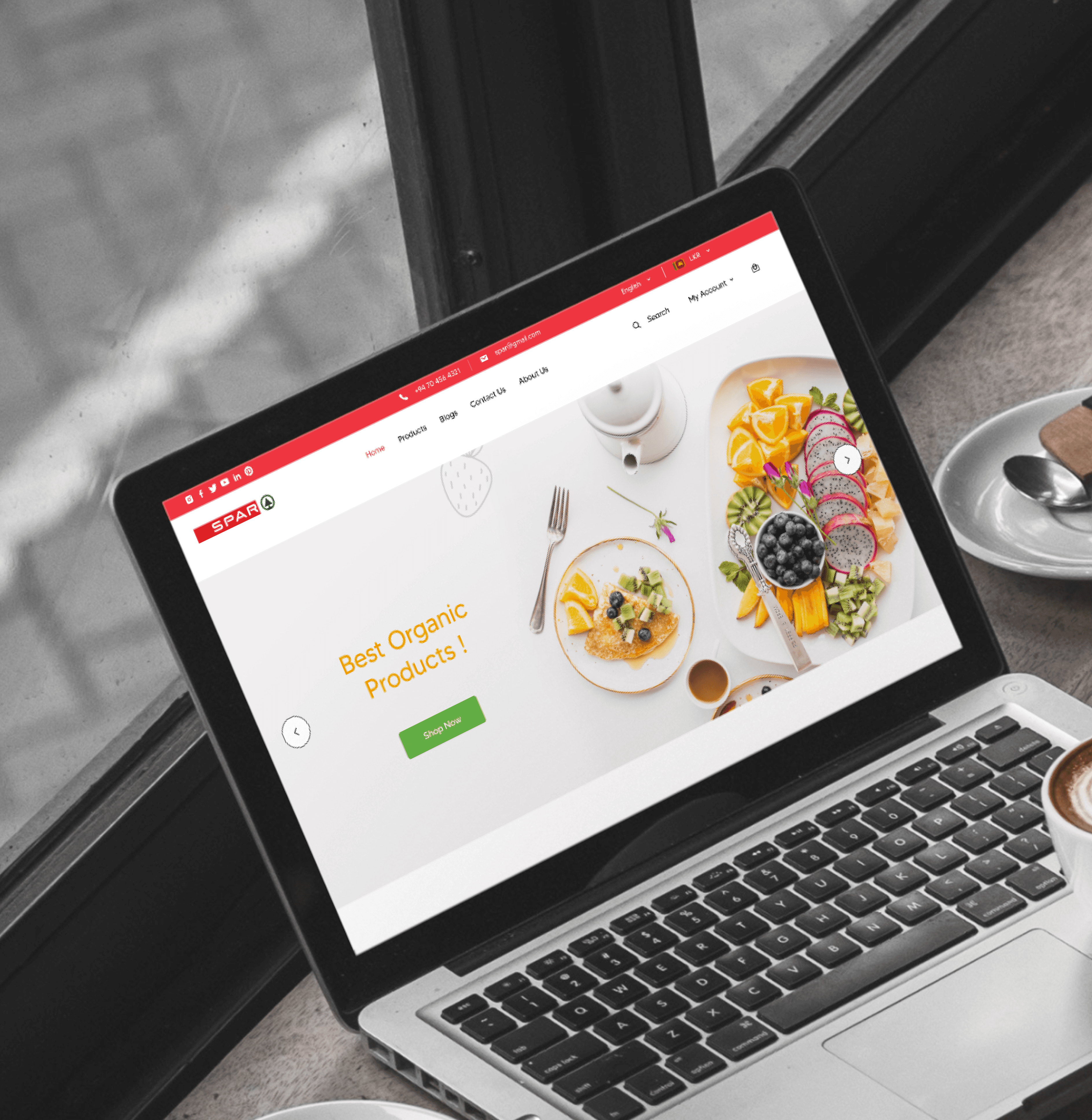
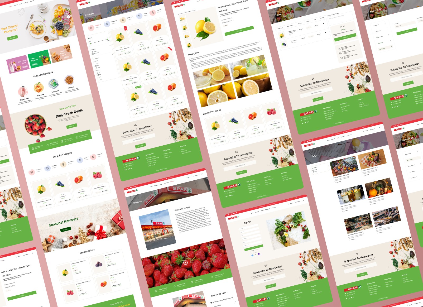
The redesigned Sri Lankan Spar website prioritises user-friendliness and delivers a significantly improved online shopping experience. A clean, modern aesthetic enhances visual appeal, while a complete overhaul of navigation and search functionality simplifies product discovery. Detailed product pages with clear images and comprehensive information empower customers to make informed decisions. The website also offers enhanced account management, granting customers full control over their profiles, delivery details, passwords, and order tracking. These improvements streamline the entire shopping process and foster a sense of convenience and trust for Sri Lankan Spar customers.
Process
I've adopted a user-centric approach, iterative design, and rigorous testing, ensuring that the app met the target audience's needs and preferences effectively.
My design process,
Define: The design process began with a thorough assessment of the existing Sri Lankan Spar website. I identified key issues that hindered the user experience, including outdated visuals, confusing navigation, and insufficient account management features. Understanding the need to create a more efficient and appealing platform, I aimed to design a site that not only looked modern but also functioned intuitively.
Research: In the research phase, I conducted user interviews and usability tests to gather insights into customer preferences and pain points. This research was crucial in understanding the specific needs of Spar’s customer base. I also analyzed competitors’ websites to benchmark industry standards and identify best practices. Collaborating with the client, I ensured that the redesign aligned with their business goals and customer expectations.
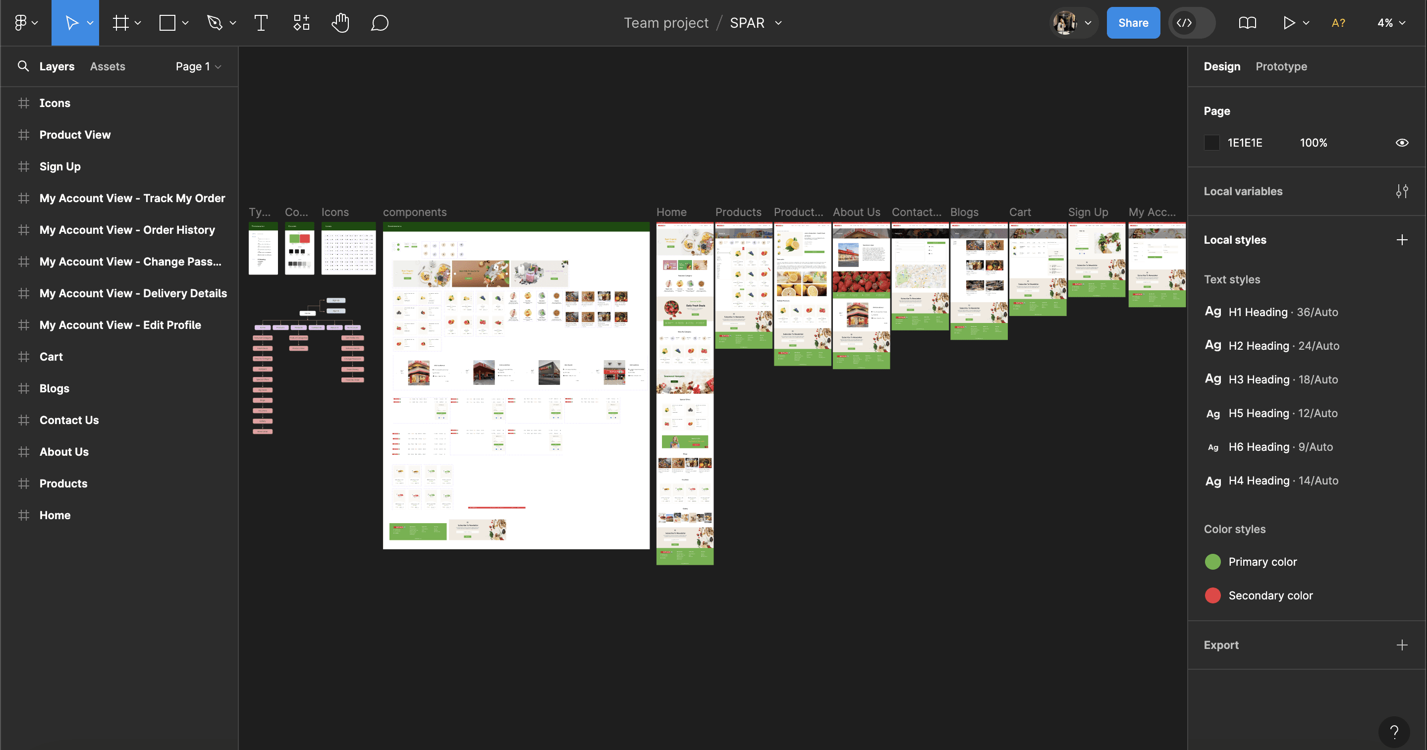
Low fidelity prototyping: Moving into the low-fidelity prototyping phase, I created initial sketches and wireframes to map out the website’s new structure. These wireframes were then translated into digital formats using Figma, allowing for a more detailed and organized representation of the site’s layout. This stage involved refining the navigation flow and ensuring that all key features were logically placed and easily accessible.
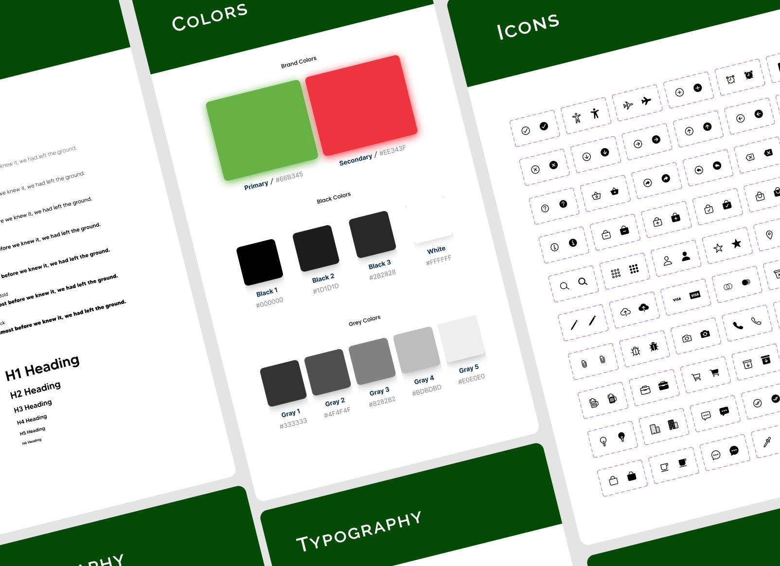
The high-fidelity prototyping: High-fidelity prototyping followed, where I designed detailed, visually appealing pages in Figma. These prototypes included high-quality images, cohesive color schemes, and modern typography to enhance the visual appeal. Interactive elements were incorporated to simulate the user experience, making it easier to identify and address potential usability issues.
Testing: Finally, I conducted extensive usability testing with high-fidelity prototypes to gather feedback. This iterative process allowed me to make necessary refinements based on real user input, ensuring that the final design was both user-friendly and visually compelling. Continuous collaboration with stakeholders throughout the process ensured that the redesign met both user needs and business objectives.
Key Takeaways
Empathy in Design: The project underscored the importance of understanding user needs and preferences. Conducting user interviews and usability tests helped me gain valuable insights, allowing me to design a website that truly catered to customer expectations. This empathy-driven approach proved essential in creating a user-friendly and effective platform.
Enhanced Account Management: Improving account management features was a key aspect of the redesign. Allowing customers to easily track their orders, update their information, and access their purchase history added significant value to the user experience. These enhancements fostered a sense of trust and convenience, encouraging repeat business.